Okay bestie, if you’ve been scrolling for inspiration like me, these home painting ideas are exactly the tiny, joyful fixes that change how a room feels without breaking the bank.
I wrote this because I spent an entire weekend testing paint colors, finishes, and simple tricks so you don’t have to – I learned a lot the hard way and want to save you time. You might laugh at some of my “oops” moments, but those mistakes taught me clever hacks that actually work.
Stick around and I promise you a dozen fresh looks, practical tips, and the kind of encouragement I would give you over coffee when you finally pick up that brush.

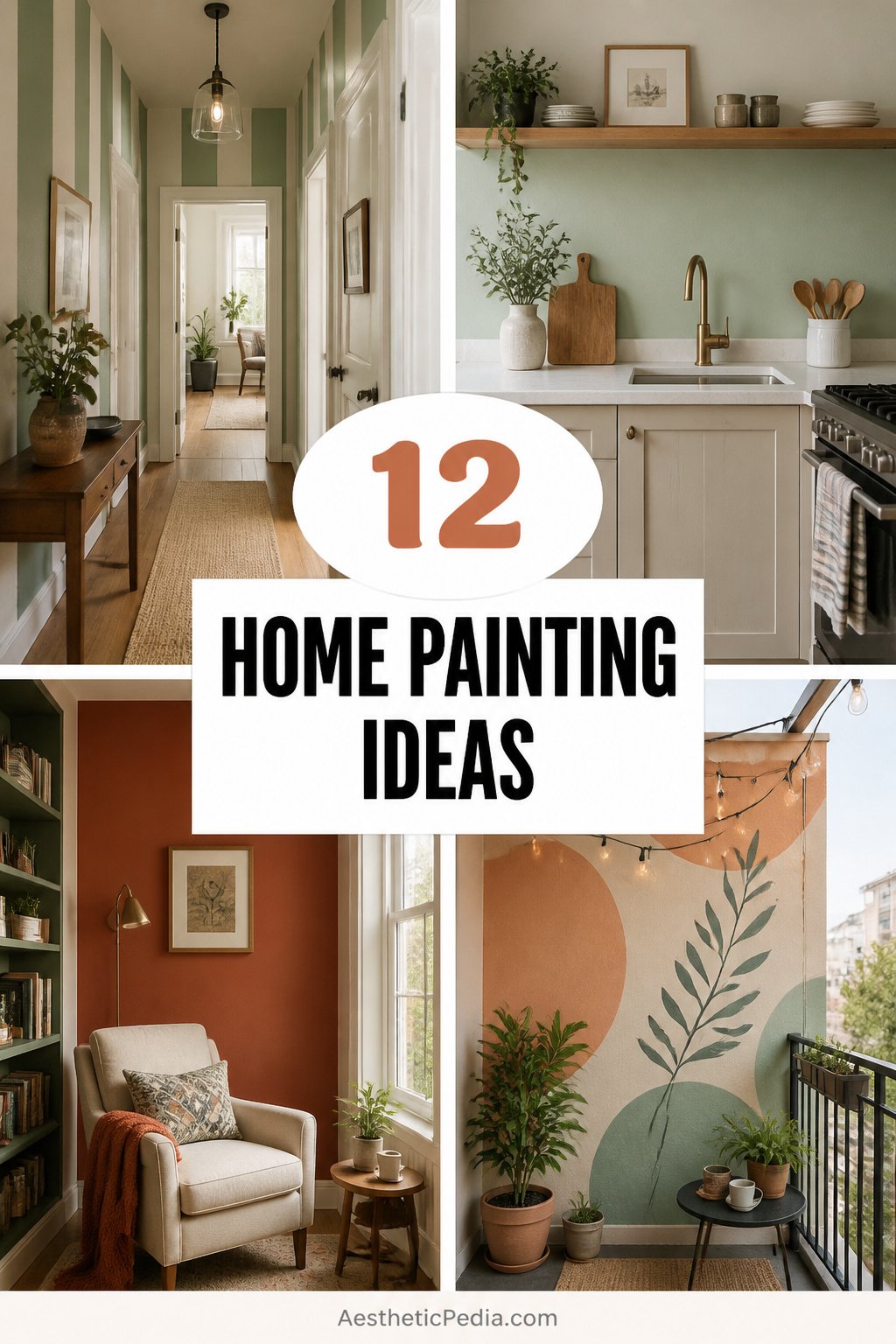
12 Home Painting Ideas To Try Today
Bold Accent Walls
Try a single bold wall to anchor a room and everything else will feel intentionally styled instead of mismatched, which is why I love this blue and white abstract vibe that reads modern but playful. You can test colors on poster boards, and evaluate them at dusk as well as midday to make sure they flatter your lighting. Painting one wall is fast, affordable, and dramatic without commitment, so it’s my go-to when I want change but not chaos.
Warm Hardwood Pairing
This living room shows how paint and rich hardwood floors can play off one another – choose a paint tone that enhances the wood’s warmth rather than fighting it. I once painted my own lounge a soft clay after realizing my floors had hidden honey tones, and the whole space felt cozier instantly. If you want luxe looks on a budget, prioritize undertones and try a peel-and-stick sample under a sofa for a day to be sure.
Plant-Friendly Green Rooms
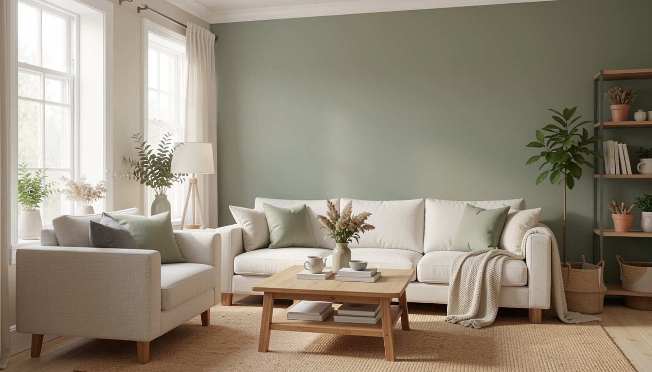
Green paint paired with natural textures makes rooms feel alive and calm, and this example proves that you can have bold color without overwhelming the senses. Coordinates with plants by matching a subtle shade to the foliage’s undertone instead of copying it exactly, which keeps the palette intentional. You will notice how plants pop more against a thoughtful backdrop, so try a mid-tone sage before committing to a deep emerald.
Soft Neutral Bedrooms
For bedrooms, soft neutrals let bedding and textures shine while supporting restful vibes all night long – this room proves less can be oh-so-rich. Layering paint with textiles in the same family creates a curated look without too many decisions, which is perfect for sleepy mornings. When in doubt, pick the color you can imagine waking up to on a Monday and still smiling.
Window-First Calming Corners
Painted corners near windows can enhance natural light and create a cozy reading nook, so consider soft blues or warm creams that diffuse glare rather than fight it. Position seating to take advantage of that glow, and use a slightly higher sheen on trim to reflect light subtly for a brighter feel. This trick is simple but impactful, and it turns an overlooked corner into your new favorite spot.
Hand-Painted Floral Door
Small graphic details like painted flowers on a door can feel whimsical and intentional, offering charm without major renovation or expense. Use a steady hand and thin brushes for detail work, and seal with a clear satin coat for durability against hands and humidity. If you enjoy crafts, this is a low-stakes project that feels personal and bespoke.
Mural Magic Bathrooms
Bathrooms love a playful mural because they are small canvases with high visual payoff, and I still remember painting a tiny floral near my sink that made morning routines feel fancy. Start with a sketch, transfer with chalk, and paint in layers so colors stay vibrant against tile or semi-gloss paint. The result is a boutique-hotel vibe in a weekend, and guests always ask where you had it done.
Tile-Ready Fresh Coats
Empty rooms with tile floors are the perfect blank slate for daring color choices because the floor anchors the palette and tolerates bolder walls. Choose a durable paint type for high-traffic areas, and test a stripe or accent in the room to make sure reflections from tiles don’t alter your chosen tone. You may be surprised how a brave wall can redefine the whole entryway or sunroom.
Botanical Accent Panels
Hand-painted leaves and large botanical motifs create an organic focal point that reads custom and artistic without being precious, and this look pairs well with natural wood and jute. Use stencils if freehand feels daunting, but allow slight variations to keep it from looking factory-made. Once finished, a satin finish will protect brushwork while letting the artwork breathe.
Cozy Earth Tone Living
Earthy tones like terracotta, warm mustard, or soft cocoa calm a living space and make layered textiles read intentional rather than frumpy. Mix paint finishes for contrast – matte walls with glossier trim feels edited and slightly modern. If you want a lived-in, cozy vibe that invites you to stay, these palettes almost always work for neutral furniture and lots of plants.
Curated Gallery Backdrops
Painting a gallery wall backdrop a single color unites a variety of frames and art pieces so the arrangement looks cohesive rather than chaotic. Go slightly darker than the wall so artwork pops, and consider adding a picture rail or thin shelf for flexible styling. I organized my photos this way and swapping pieces became fun instead of stressful.
Shelving Backdrop Paint
Painted niches and shelf backs give depth to collections and houseplants, and a saturated color behind your bookshelves can make ceramics and greenery sing. Use a small roller for a smooth finish and tape carefully to get crisp shelf lines, then style in layers so the color interacts with the objects. This is one of my favorite tiny upgrades because it looks expensive but is so cheap and simple.
How to Actually Make This Work For You
Set realistic expectations by testing large swatches in different lights, plan your furniture placement before you commit, and pick one small project to finish first so you build momentum. Balance color intensity with neutral anchors like rugs and throws, and finally embrace imperfection because texture and slight variation often make the room feel more human and comfortable.
How long does painting a room typically take?
Answer – Most rooms can be primed and painted in a weekend by one person if you work steadily, though drying times and prep can add a day or two. Allow extra time for trim and multiple coats when using bold colors.
Do I need a primer for every paint job?
Answer – Primer is essential when covering dark colors, raw drywall, or when switching from glossy to matte finishes, and it helps reduce the number of topcoats needed. For light color refreshes over similar shades you might skip it, but primer is a safety net I rarely forgo.
What finish should I choose for high-traffic areas?
Answer – Satin or semi-gloss finishes are durable and easier to clean for hallways, kitchens, and bathrooms, while flat or matte finishes hide imperfections in lower-traffic rooms. Consider the sheen as part of your visual plan, not just a practical choice.
Can I paint over wallpaper instead of removing it?
Answer – You can paint over wallpaper in some cases, but it’s often temporary and risks adhesion problems; removal is usually the better long-term solution. If you must paint, use a high-build primer and be prepared to replace the wall covering later.