Okay, friend – if you’re scrolling for home color schemes ideas and feeling overwhelmed, you’re in the right place. I get it, picking a palette feels huge but it can also be the most fun part of decorating.
I put this list together because I spent months swapping swatches around my apartment and I learned a few shortcuts the hard way. You don’t need perfect decisions to make a room feel intentionally beautiful.
Stick with me and you’ll leave with 25 clear looks, quick tips, and little tricks I actually tried myself.
These 25 Home Color Schemes Ideas Will Transform Your Space
Warm Brown Living Room
This cozy living room leans into layered browns so the whole space reads calm and collected. I painted my own den a warm taupe once and the room felt instantly grounded. If you like neutral warmth, add textured pillows and a rug to keep it from looking flat.
Orange-Green Swatch Mix
Here you get playful orange and green swatches that still feel grown-up when balanced with warm woods. You can use small accents first – a lamp or a throw – to test the combo. I love how unexpected cushions can sell a daring palette without commitment.
Blue And Gray Bouquet
A mix of blues and grays with white florals makes for a serene, layered look that’s perfect for living rooms or powder rooms. Try a deep navy as your anchor wall then soften with pale gray textiles. You might find this calm vibe helps you relax at the end of a long day.
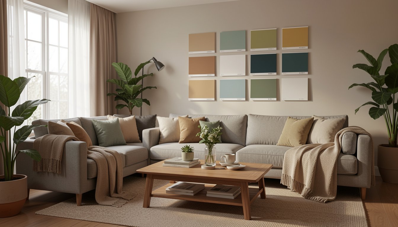
Paint Color Collection
This image is basically color theory on display – dozens of tones arranged so you can see relationships. When I’m indecisive I sit with a board like this and narrow to three favorites. You should always test samples on the wall – light changes everything.
Green-Blue Sofa Pairing
Green and blue furniture together create a sophisticated coastal-meets-forest vibe without looking thematic. Add brass or light wood accents to warm the combo up. If you want a restful living area this is a top pick.
Botanical Bedroom Greens
Greens in a bedroom can feel fresh and surprisingly romantic when paired with crisp white bedding. I kept a small plant on my nightstand for months and it changed the whole mood. Keep bedding neutral so the wall color stays the focus.
Blue, White, And Gold
Blue and white look classic, and gold hardware instantly elevates the whole palette to a luxe feel. You don’t need a lot of gold – small light fixtures or handles go a long way. It’s a subtle trick that makes the space read intentional.
Green Restaurant Interior
This deep green paired with natural wood gives a social, cozy energy perfect for dining areas. If you want that restaurant vibe at home, consider a bold wall and mix-in reclaimed wood furniture. Friends always comment that green feels unexpectedly welcoming.
Styled Shelves And Tones
Arranging vases and baskets is a fast way to test a palette in real life without paint. You can move items around until the balance feels right. I once rearranged my whole shelf in ten minutes and saved myself a repaint.
Material And Surface Swatches
Seeing wood, tile, and other finishes together helps nail down cohesive colors across a room. You’ll want to think about undertones – warm vs cool – so pieces don’t clash. Hold samples next to each other in natural light for best results.
Furniture Collage Inspiration
A collage of furniture shots shows how textures and hues play out together, which is helpful when you buy secondhand pieces. If you’re sourcing a sofa, pin images next to your paint samples. I ended up rethinking my rug choice after making a similar collage.
Green Kitchen Cabinets
Green cabinets paired with wooden countertops give a kitchen that modern cottage look everyone loves right now. Start with a muted green if you’re unsure, then add brass fixtures for warmth. Even small changes like painted lower cabinets can feel transformative.
Blue Living Room Pop
A room full of blue sofas and rugs reads fresh and cohesive when the walls stay light. For a personal touch, layer in patterned cushions to avoid monotony. You should try swapping cushion covers seasonally to keep it lively.
Green Faucet Still Life
Even small touches like a colored faucet or greenery on the sink can hint at a broader palette and inspire larger choices. I used tiny accents like this to convince myself to go bolder on one wall. It’s an easy, low-cost way to test a look.
Cozy Fireplace Palette
A mantel with warm neutrals and a painting creates a focal point that ties wall paint into decor. If your room feels disjointed, anchor one area and build the palette outward. Lighting near the fireplace affects paint tones, so check both day and night.
Minimal Vase Pairing
Two simple vases can show how color and form work together without clutter. Neutral palettes benefit from little sculptural touches like these. I keep a small trio of vessels and swap them between rooms for instant cohesion.
Green Bedroom Touches
Green walls with white bedding and plants feel spa-like and soothing for a bedroom. Layer soft throws and mixed textures to avoid a flat look. You might be surprised how restful a single saturated wall makes the whole room.
Floral Swatch Play
Using flowers and swatches together helps visualize seasonal palettes and how colors look with organic shapes. This trick helped me pick spring hues for my sunroom. Grab a bouquet next time you’re choosing a paint family.
Gray Dining Room Calm
Gray walls give dining rooms a quiet, elegant backdrop for bold art or a striking light fixture. To keep it warm, add wooden furniture or brass accents. You can make gray feel moody or airy by varying your textiles.
Material Mix With Green
Combining ceramics, textiles, and greenery shows how a palette will perform across surfaces. You should keep an eye on undertones so everything reads cohesive. Mixing finishes adds depth without changing your base colors.
Neutral Sofa, Green Walls
Neutral sofas are a gift – they let green walls shine while keeping the room usable and timeless. Add patterned pillows to create dimension. I moved a neutral couch into a green room and it instantly felt curated.
Brown And Blue Swatch Study
Brown and blue can be surprisingly chic when you balance warm and cool tones thoughtfully. Start with one dominant color and use the other for accents. Small changes like a rug or throw can shift the whole vibe.
Fireplace Mirror Styling
A fireplace framed by a mirror and layered decor gives a room instant personality, and the surrounding colors should complement that focal point. Consider a paint tone that reflects in metallics for cohesion. I once rearranged a mantel to better match my wall color and it saved the whole space.
Green Bedding Accent
Green sheets and pillows are an easy way to introduce a color story without painting. Pair with wooden shelves above the bed for a warm contrast. This is one of my favorite low-commitment updates for renters.
Paint Pots And Nature
A cluster of paint pots next to flowers and rocks gives an earthy, handmade feel and helps you see color in context. You should test samples on different walls since lighting shifts tones dramatically. This hands-on approach usually ends my indecision pretty fast.
How to Actually Make This Work For You
Start by choosing one dominant color, one supporting tone, and one accent so your palette feels intentional without being rigid, and test samples on multiple walls during different times of day to catch undertone shifts. Keep furniture and large textiles neutral if you love flexibility, and introduce color through art, cushions, and plants to experiment without committing to paint.
How do I choose the right undertone?
Look at paint chips in natural light and compare warm vs cool options against your flooring and furniture – the undertone should harmonize, not match exactly. You can also take a photo of the sample next to key pieces to view at different times.
Can I mix several color schemes in one home?
Yes – keep a unifying element like consistent trim color or a recurring accent hue so rooms feel connected. Varying intensities of the same family usually read cohesive across spaces.
What if I rent and can’t paint?
Use textiles, peel-and-stick wallpaper, removable decals, and art to test a palette without permanent changes. Swap out items seasonally to keep the look fresh and personal.
How many samples should I test?
Test at least three finalists on different walls and observe them morning and evening to see how light changes the mood. Fewer than that and you may miss a detail that matters to your overall vibe.